The Home app from Apple has always seemed tacked on. Most likely because it was Apple delayed releasing a control app for the HomeKit home automation software framework for two years because it didn’t want to create one. Even after iOS 10’s Homekit app was ultimately released in 2016, little substantial progress was made. But the app is getting a complete revamp in preparation for the release of iOS 16 this fall. It appears that Apple is finally serious about its small smart home initiative.
Since the introduction of the iOS 16 public beta version on July 11 (it will also be available for the iPad, Mac, and Apple Watch), I’ve been trying the new Home app on an iPhone 13. At the same time, the change appears to be primarily cosmetic (Nice icons! Newly created buttons! It’s Apple’s style (new wallpaper!). This means that, unlike the old Home app, it has a software design that is both attractive and functional.
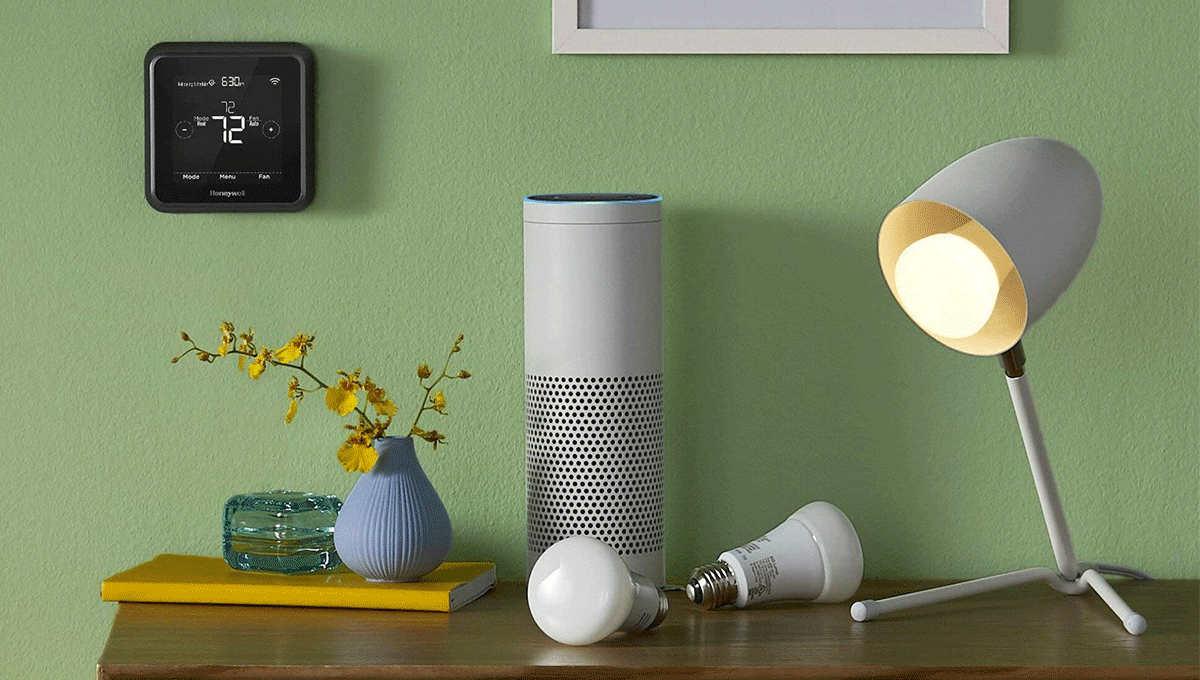
The imminent release of Matter, the new smart home standard created by Apple in collaboration with Google, Amazon, Samsung SmartThings, and many others, is unmistakably the driving force behind all of this work. Many more devices will be compatible with HomeKit when Matter launches later this year. Less than 1,000 items are currently HomeKit compatible. Apple still has much work to do compared to the more than 100,000 smart home devices compatible with Amazon’s Alexa platform.
Rebuilding the Home app’s foundation to make it Matter-ready and rethinking the user interface to make it functional with more than 20 associated devices are also parts of this development. With a few minor hiccups here and there, usability-wise, Apple has essentially succeeded. The new Home app is simpler to use, has more user-friendly settings, and—for my money—allows you to organize your gadgets as you like.
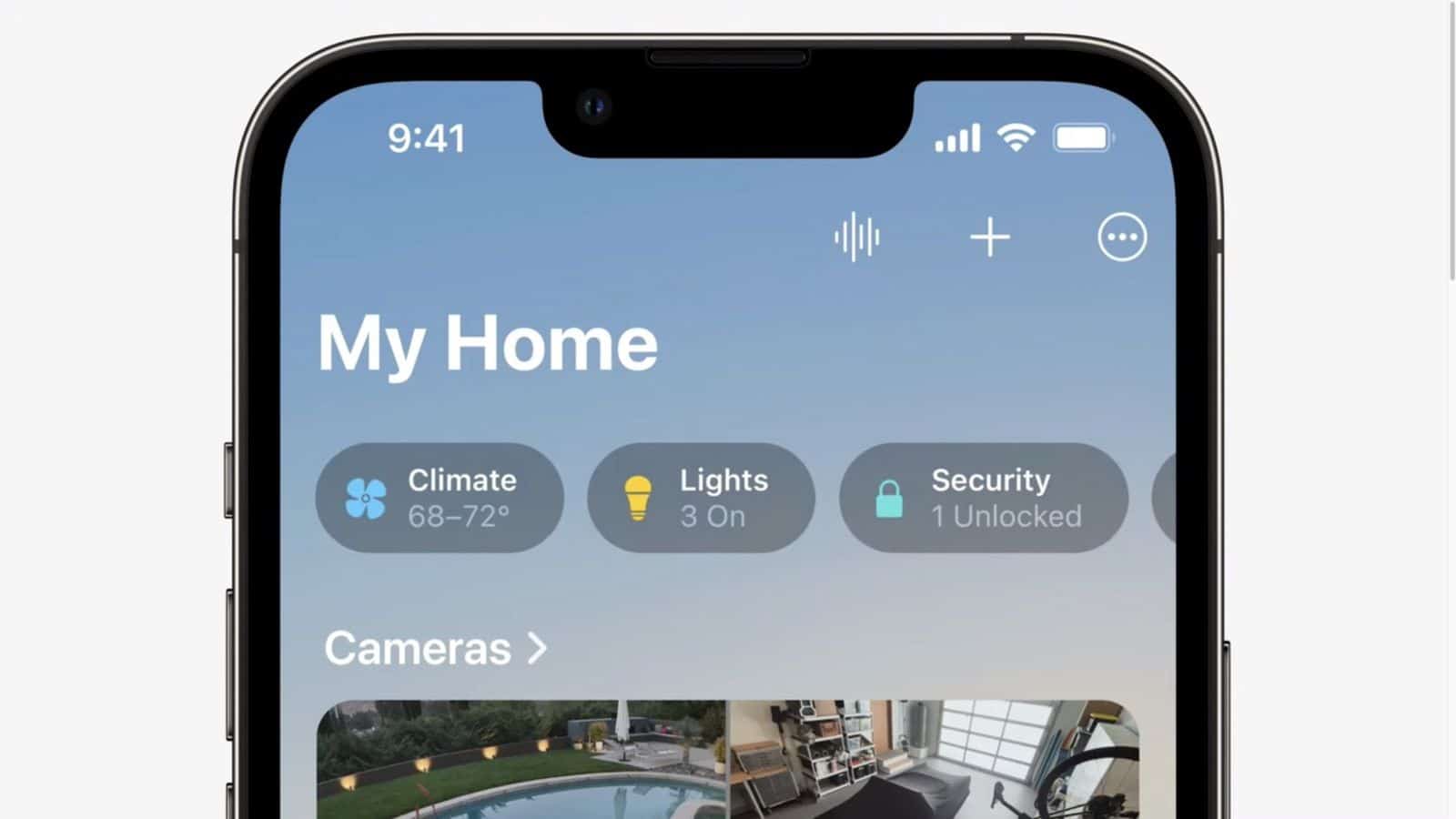
The new software no longer presents you with an unending list of “Accessories” and “Favorites” (how am I supposed to choose favourites among my lamps?), after which a stream of camera photos appears. Instead, you can now easily navigate to all of your Rooms while still seeing your Favorites and Cameras, thanks to some horizontal wizardry. Additionally, you can quickly arrange all of your devices by their type using the new Shortcuts area at the top, which includes Lights, Security, Climate, Speakers & TV, and Water. The process of turning on a light or unlocking a door used to involve annoying taps, swipes, and pecks. Still, this organizational structure has made it more usable.
The Apple Home app is getting three significant updates.
Better buttons
The way buttons (tiles) function is a significant usability change. I’ll admit that it took me a few minutes of annoying aggravation to realize that in order to turn each gadget on or off, you must tap the icon located on the left side of the tile. (And based on Reddit, I’m not alone, either.)
This was formerly accomplished by tapping anywhere. The device’s control panel now opens when you tap the tile itself; it is substantially unaltered from the Home app that was included in iOS 15. You can tap the control panel once more to access other features, such as dimming a light. Using the icon in the lower right or by sliding up from the bottom, you can easily access the device’s settings from this page. A long hold on a button, which previously brought up the control panel, now displays a menu with the choices Edit Home View and Don’t Show in Home View. These provide you with additional options for personalizing your home view, which we’ll discuss later.
A happier Home View
The primary home screen has undergone a significant overhaul as well. There is nothing there to replace the Rooms tab. Merely some lovely grey space (a sure sign Apple is taking the design seriously). Instead, Home, Automation, and Discover are the sole tabs. The final two are substantially identical to iOS 15’s (more on that disappointment later).
When you launch the app, all of your Rooms are now conveniently located on the home page. The only difference between this new organizational structure and the Google Home app is that Apple lets you alter it while Google doesn’t.
Every actionable device in this Home View is visible to you unless you conceal them. This means there are no sensors or objects whose states cannot be manually changed. The cameras have been moved from the bottom of this screen all the way up to the top, and they are now in a horizontal scroll rather than a lengthy linear view that takes up the entire space of the app. Scenes, which are likewise horizontally oriented, are immediately below. Favourites come next, followed by Rooms.
You can drag and drop everything in the new Reorder Sections option to reorder these sections, whatever you choose. Your Rooms were formerly required to be arranged alphabetically.
With the new design, you can easily access any device you want to operate by quickly scrolling down the main Home View page. Additionally, by pressing on a new row of Shortcuts at the top, you can expedite the procedure if you are aware of the sort of device. In essence, these are filters that simplify the Home View to display particular devices linked to Climate (thermostats and blinds), Lights, Security (locks and cameras), Speakers and TVs, or Water (sprinklers, leak detectors).
For a typical menu with options for Home Settings, Edit Home View, and Reorder Sections and a listing of all of your Rooms, click the three dots in the top right corner of your screen.
Change it up with customization.
The ability to rearrange device icons within each area, as you do with apps on the iPhone home screen, is the third largest change and my personal favourite. To enter the well-known “jiggle mode,” long-click any button and select Edit Home View from the pop-up menu. Now, you may move and even resize your buttons wherever you want (small or large). Feeling free is lovely.
Finally, you can conceal a device from the Home View completely. I may be in the minority in that I’m happy about this vanishing act. Still, I test many devices and find that when they’re unplugged, many become unresponsive to the Home app. I can now hide them from view without deleting them (if you delete a device in HomeKit, it can be tricky to get it back). For the majority of users, this will be useful for hiding a device that basically manages itself. You don’t visit very often in the app (a security system hub, for example), helping to maintain a cleaner Home View.
The ability to rearrange device icons within each area, as you do with apps on the iPhone home screen, is the third largest change and my personal favourite. To enter the well-known “jiggle mode,” long-click any button and select Edit Home View from the pop-up menu. Now, you may move and even resize your buttons wherever you want (small or large). Feeling free is terrific. Even if a gadget is hidden, it still appears in the perspective of each particular room. The only difference between this view and the Home View is the categorization of devices. Additionally, it keeps the glanceable tiles from iOS 15 that displays information about the room’s sensors in place of the shortcuts up top.
Many new icons for Scenes and a few additional icon possibilities for lights, blinds, and smart plugs round out the other new customization options. Even unicorns exist. Additionally, your Scene Icon can now have a specific colour. The unicorn I have for my Worktime scenario is purple. The timing of the hue, however, is somewhat arbitrary. It appears to be after a scene has been completed and can be activated. When the Scene tile is grey, the colours are hidden.
The three biggest fails in Apple’s Home app
The ideal smart home experience is one in which you aren’t required to take out your phone in order to operate the equipment. Of course, app control of a smart home is really just remote control.
This is where voice control can help by essentially duplicating what the app can do. As I’ve previously mentioned, Siri is a capable smart home controller (given the competition). Therefore, the primary function of a controller app like House is to configure the Scenes and Automations that eliminate the need for a remote control in your home. However, Apple has not significantly improved Automations, despite the fact that it urgently needs to.
Automations are still disorganized.
The Automations tab is a complete jumble and hasn’t altered much. The alphabetical and numerical ordering of the existing Automation is annoying. The ability to arrange them by location or room would be excellent. The process for creating Automation remains the same. Still, the layout has changed from tiles—which occasionally didn’t show the full device name—to an easier-to-read list style when choosing a device to initiate the Automation.
Conditions remain poor
Because there are so few options for conditions and no possibilities for multiple conditions on the same Automation, the options for creating Automations are still minimal. For instance, you still can’t tell a motion sensor to disregard the Automation when an Apple TV is showing a film or to turn off the lights if it hasn’t detected activity for a predetermined time.
No new functions or device categories
Existing device categories have no new features in iOS 16; for instance, smart plugs still lack the ability to track energy use, and cameras with pan and tilt or higher than 1080p video resolution lack the ability to duplicate such features in the Home app. Apple has added the option to start Automation based on more sensor data (light, temperature, humidity, and air quality) in previous versions, but new device categories have not yet been added. Air purifiers were the most recent noteworthy addition in 2021.
When Matter arrives, some of these problems might be resolved, and new gadget types (such perhaps robot vacuums?) might then appear. Other issues, including dealing with numerous conditions, are awkwardly handled by third-party apps. But rather than depending on apps made by device manufacturers or Apple’s Shortcuts app, which only adds to the confusion, Apple has to address the fundamental problems directly in the Home app. Additionally, the Home app urgently requires permissions so that you can provide family members (such as children) or visitors restricted access to particular devices or areas.
As part of iOS 16’s new Lock Screen Widgets, there is a new option for HomeKit widgets outside of the Home app. There aren’t many customizing possibilities, despite the fact that they provide glanceable information, such as whether a door is locked or open, how many lights are on, the status of a thermostat, and an overview of the Climate, lights, and locks in your home.
While in edit mode, you can tap on the widget to choose which lock or thermostat it displays, but you cannot change the wider widget choice. It would be convenient to have the option to pick which device or Scene to display in this area. Or, even better, use the widget to control it directly. These widgets currently only lead you to the Home app and do not allow you to control anything. It is comparable to the Control Center widget and suggestions (which remain the same in iOS 16), but at least those tiles occasionally perform an action.


Leave A Comment